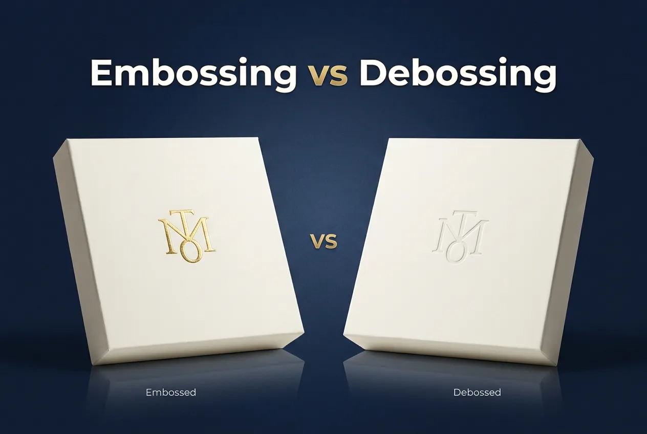
Embossing raises a design above the surface, while debossing presses it into the surface. Both finishes add texture and a premium feel to packaging, and both work with or without ink and foil. The two get mixed up a lot, and plenty of people assume they’re the same thing. They’re not. The direction changes how the finish looks, how it feels in the hand, and what it costs. You’ll find them on everything from custom rigid boxes to business cards and leather goods. At Orbix Packaging, we offer both, so this guide covers how each one works, what tooling and material thickness it needs, and how to choose.
Embossing vs Debossing at a Glance
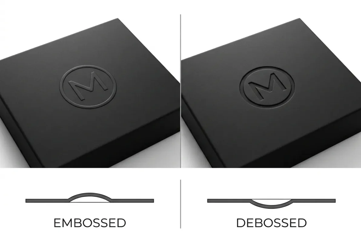
Here’s a quick side-by-side comparison before we go into detail.
| Feature | Embossing | Debossing |
| Visual effect | Raised above the surface | Pressed into the surface |
| Tactile feel | Bumped, dimensional | Dented, smooth |
| Dies needed | Usually two (male and female) | Usually one |
| Reverse side | Often shows a faint impression | Usually stays cleaner |
| Cost | Often higher | Often lower |
| Material thickness | Best on rigid or thick stock (about 250 to 300 gsm or more) | Works on thinner and flexible stock (about 180 to 250 gsm), kraft and soft materials |
| Detail level | Best for bold shapes | Best for fine lines and small text |
| Best for | Statement logos and gift packaging | Subtle, refined branding |
What Is Embossing?
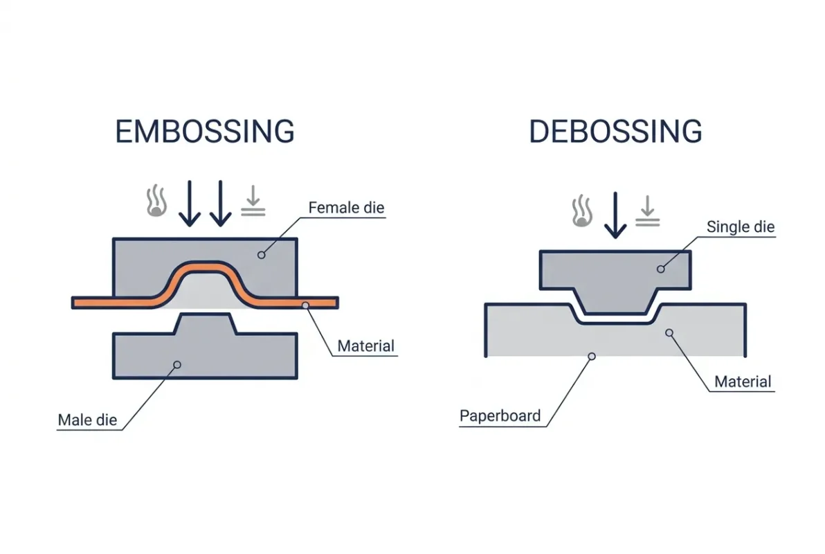
Embossing creates a raised design on paper, board, or leather. The result catches the light, casts a small shadow, and feels like a bump under your fingertip. That’s why an embossed logo is a favorite on gift packaging, business cards, and certificates, where people pick the item up and handle it. It works best with bold shapes and simple artwork. The drawback is that very thin lines can look soft at the edges, and raised areas can flatten if a box gets rough handling.
What Is Debossing?
Debossing does the opposite. The design is pressed into the surface, so it looks sunken and feels like a shallow dent. A debossed logo reads as quiet and refined, which is why you see it so often on leather wallets, notebook covers, and minimalist boxes. It also holds fine detail well, so small text and thin lines stay sharp. The trade-off is that it can look plain on its own. Adding foil or ink inside the recess fixes that. And pressing too deep into thin board can weaken it.
What Is the Core Difference Between Emboss and Deboss?
Is debossed in or out? In. The design is pushed below the surface. The opposite of emboss is deboss, just as the opposite of a raised design is a recessed one. The tools and pressure are similar, but the direction is reversed, and that one change affects how the finish looks, feels, and costs.
How Embossing and Debossing Work
Embossing uses two dies. A male die carrying the raised shape sits on one side, and a female, or counter, die with the matching cavity sits on the other. The press squeezes the sheet between them using heat, pressure, and a set dwell time, and the material lifts into the design.
Debossing is simpler. A single die presses into the front of the material and leaves an impression. Because it doesn’t need a matched counter die, setup is usually quicker.
Either process can be done blind, with no ink or foil, or combined with foil stamping. Pressure matters in both. Too much can distort thin board, and too little leaves a faint, weak impression.
Key Differences Between Embossing and Debossing
Appearance and Texture
Embossing is bold and dimensional. It makes a logo stand out and invites touch. Debossing is calmer. It relies on shadow and depth rather than height, so it feels more understated. If you want people to notice the finish from across a shelf, go raised. If you want them to find it when they pick the box up, go recessed.
Material and Thickness
Thickness is where most finishing problems start, so here are the working numbers we use:
- Rigid boxes and thick board (about 250 to 300 gsm or more): the right home for embossing. The board holds the raised shape without cracking or showing marks on the back. This is why embossing is so common on custom rigid boxes.
- Thinner or flexible stock (about 180 to 250 gsm): better suited to debossing. Pressing inward spreads the pressure more evenly, so the board doesn’t buckle.
- Kraft, black card, and soft-touch laminated surfaces: debossing usually gives a cleaner result here, with subtle depth instead of a raised bump.
- Grain direction: it affects how sharp the edges look and how consistent the depth is. Confirm it before die-cutting, and avoid running a deep impression across a fold line.
Thicknesses are a guide, not a rule. Coatings, laminations, and board type all change the result, so we always test a sample on your actual stock.
Detail and Design Complexity
Debossing handles small text, thin borders, and fine patterns better because the material compresses cleanly into the die. Embossing can soften edges on tiny details, since the material stretches upward. For a detailed crest or small lettering, debossing is usually the safer choice. For a large monogram or simple icon, embossing shines.
Cost and Durability
Embossing often costs more because it can involve a matched die pair, tighter registration, and thicker, more premium stock. Debossing is often cheaper for simple designs. Final pricing depends on artwork size, depth, die type, material, and quantity, so the easiest way to know is to send us your design and we’ll quote both options.
On durability, a debossed design sits protected inside the surface. Raised embossing can flatten under pressure or friction, so it needs sensible protection in shipping.
Die Types, Die Materials and Finishing Styles
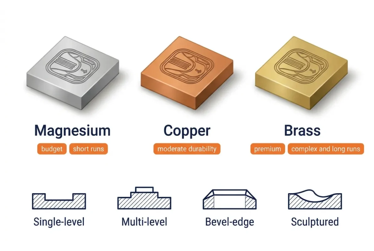
The die you choose shapes the final result as much as the artwork does.
Die metals compared
- Magnesium: the budget option, best for single-level designs and short runs. It’s quick to make but softer, so it wears faster under repeated stamping.
- Copper: also single-level, but sturdier. It suits longer runs and moderate detail, and it costs more upfront than magnesium.
- Brass: the gold standard for complex, multi-level or sculpted work and long production runs. It holds sharp detail the longest, but it’s typically two to three times the cost of copper.
Die types worth knowing
- Single-level: one even depth. The most common and most affordable choice for logos and simple shapes.
- Multi-level: several heights in one design, good for layered artwork.
- Bevel-edge: sloped sides, usually between 30 and 60 degrees. It’s useful for deeper impressions because it reduces the risk of cutting or tearing thick board and leather.
- Sculptured: hand-carved for crests, portraits, and detailed illustrations. It’s the most expensive option and best for premium, low-volume pieces.
Finishing styles
- Blind: no ink or foil, so the texture does all the work.
- Registered (foil): the impression is lined up with printed color or foil for extra contrast.
- Combination: foil and impression in a single pass, usually with a multi-level die.
Any of these pairs well with foil stamping or soft-touch lamination, which makes the design’s shadow look deeper.
Which Should You Choose?
Choose embossing if:
- You want the logo to be the first thing people notice.
- Your board is thick, around 250 to 300 gsm or rigid construction.
- The artwork is bold and simple, like a monogram or icon.
- Tactile feel is part of the product experience, as with gift sets.
Choose debossing if:
- You prefer a quiet, refined look.
- Your artwork has fine lines or small text.
- You’re working with thinner, flexible, kraft or leather-style material.
- Your budget is tight, and you want a faster setup.
If you’re still unsure, start with brand tone. A bold brand usually wants the raised design, and a calm, minimal brand usually suits the pressed-in one. Some brands combine both, using a debossed base with an embossed highlight.
Best Uses by Product
- Beauty: an embossed logo on cosmetic boxes gives a soft, premium touch.
- Jewelry: jewelry boxes work well with a blind embossed crest or monogram.
- Leather goods: debossing is a natural fit, so a debossed logo on belt boxes feels right next to the product itself.
- Perfume and spirits: a foil-accented mark on custom bottle boxes stands out on the shelf.
- Natural and handmade-style products: a debossed mark on custom kraft boxes suits food and gift packaging.
- Everyday print: paper bags, business cards, and stationery take either finish well.
Design Tips to Avoid Common Mistakes
- Keep the artwork simple. A clean shape gives a cleaner impression.
- Stay away from folds, glue zones, and narrow flaps. The board is under stress there, and the impression can crack or distort.
- Match depth to thickness. Deep impressions on thin board can weaken it or show through on the back.
- Check a sample first. The same design can look different on kraft, coated board, and rigid wrap.
Frequently Asked Questions
Is debossing better than embossing?
Neither is better in every case. Debossing suits subtle branding, fine detail, thinner stock, and tighter budgets, while embossing suits bold logos and thick stock.
Is embossing considered luxury printing?
Yes, embossing is widely seen as a premium finish. The raised design creates a tactile feel that people often associate with quality, especially when paired with foil.
Why is embossing usually more expensive?
It often needs a matched pair of dies, a more precise setup, and thicker materials. Debossing typically needs one die and less setup. Die metal and type also affect price, with brass and sculptured dies at the top end.
Can I combine either finish with foil?
Yes. Foil stamping works with both. A foil-filled deboss, or a foil-embossed logo, adds shine and makes the design easier to see.